Alex Runde
Creative Leader
eBay —
Don't bid,
buy.
A spec TV spot repositioning eBay from auction site to global buy-it-now marketplace. Research, concept, moodboard, and production from brief through final delivery.
eBay rebranded in 2012 with Lippencott to reposition itself as a global online marketplace — not an auction-style listings site. The creative challenge: make that repositioning actually land with consumers. The brief was to concept, design, and produce a spec broadcast spot that could do what the rebrand hadn't yet accomplished.
People know eBay. They still think of it as an auction site for used stuff. The buy-it-now positioning hadn't broken through.
Everyone knows eBay.
Nobody thinks what eBay wants them to think.
Primary market research revealed a clear gap between eBay's intended brand positioning and consumer perception. Across every interview, the same pattern emerged: awareness was universal, but the mental model was stuck in 1999.
"A place where you 'auction' off items."
"Popular with collectors — good place to find obscure items that may not be available in stores anymore."
"Not anything too specific. Maybe things that are out of print or hard to find."
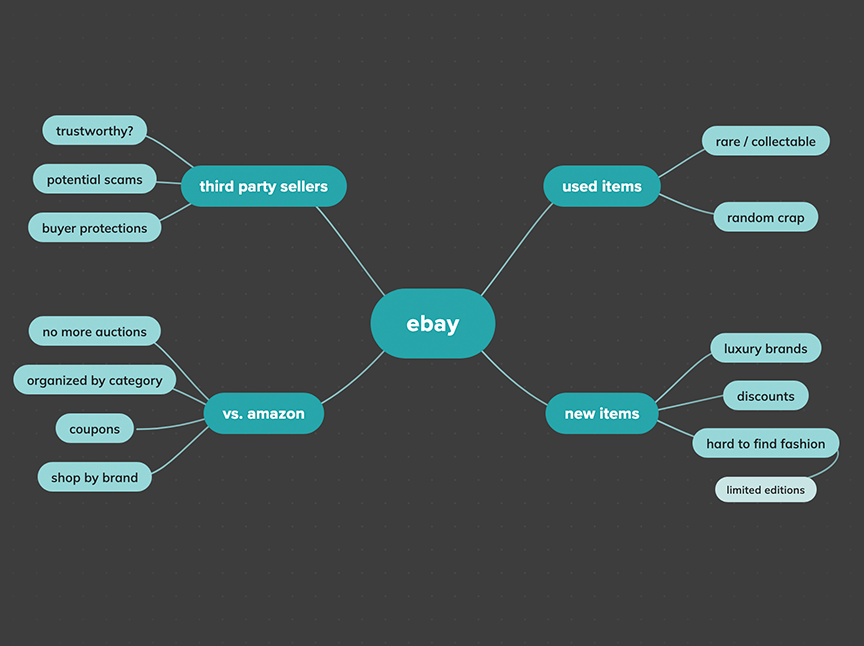
People don't consider eBay for new items — and eBay has a buy-it-now option that most people don't think about. That's the gap the spot needs to close.
Flat, abstract, and brand-led — shapes that reveal new things.
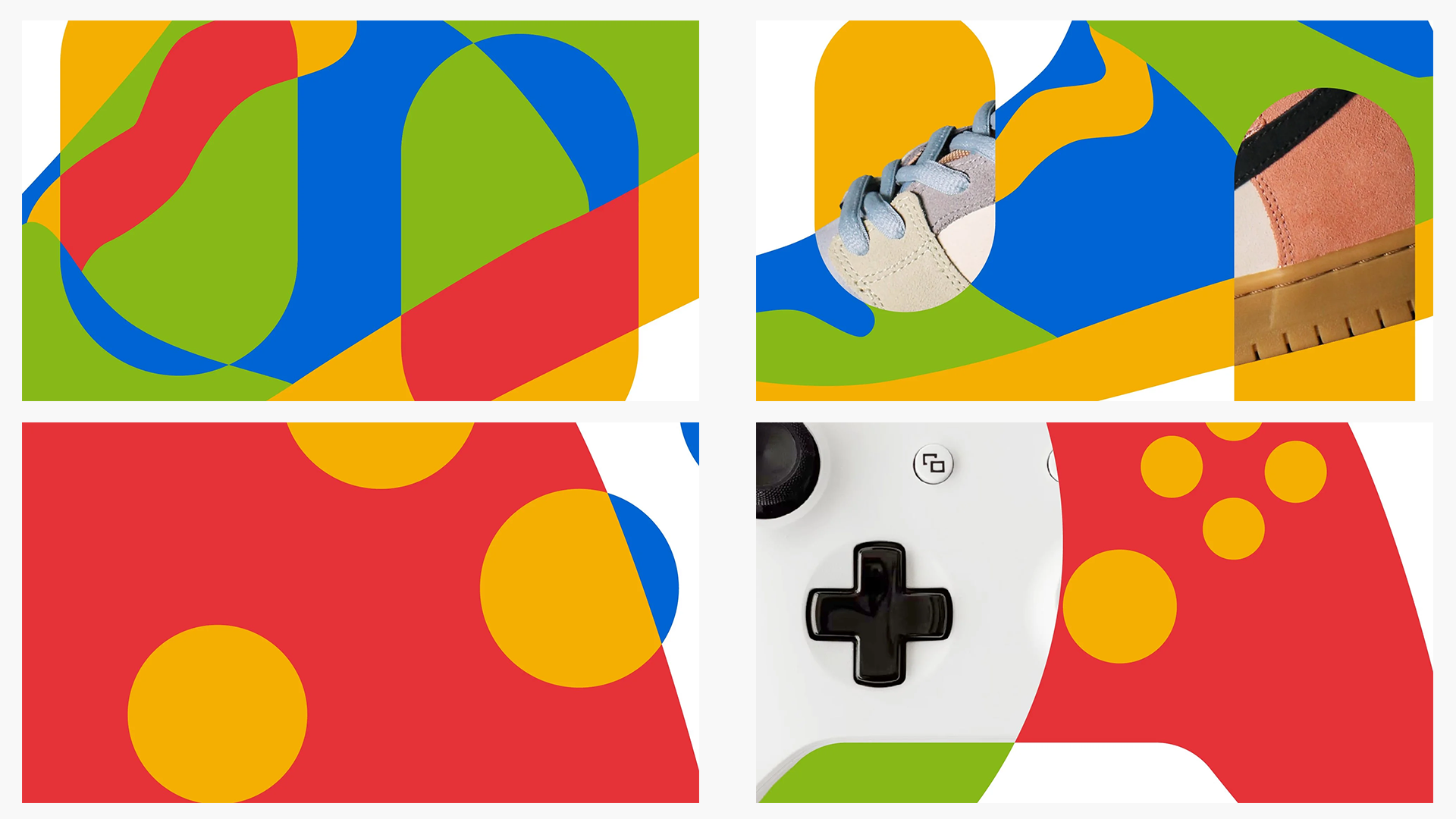
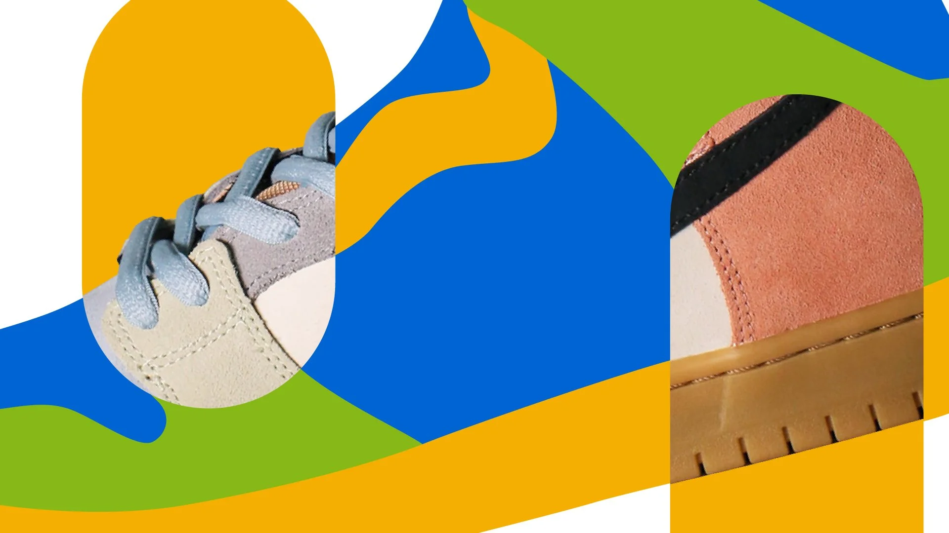
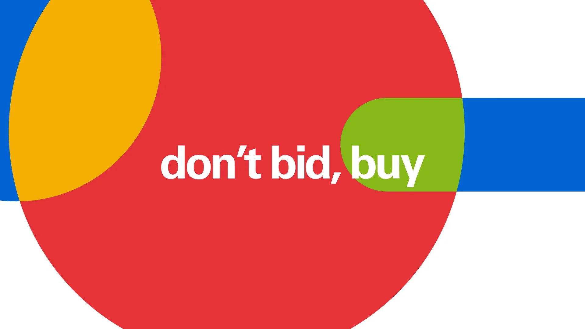
The concept pulls color directly from eBay's logo to build a flat abstract environment. Geometric shapes intersect and morph, teasing new, desirable products — but never fully resolving into the final items until the end. The payoff: "don't bid, buy. Buy it now."
Color from the logo. Red, yellow, blue, and green pulled directly from the eBay wordmark — brand-correct without being literal.
Shapes that morph. Abstract geometric forms intersect and transform, hinting at new products — sneakers, gaming controllers, phones — without showing them directly.
New items only. Every product reveal is new, never vintage or used — directly countering the perception gap the research identified.
The line. "Don't bid, buy. Buy it now." — a direct reframe of what eBay actually is, in the voice of someone who's figured it out.
Flat, bold, geometric — motion-forward.
Reference pulled from motion design, geometric illustration, and abstract visual language — all rooted in the flat, shape-driven aesthetic that would become the spot's visual world.
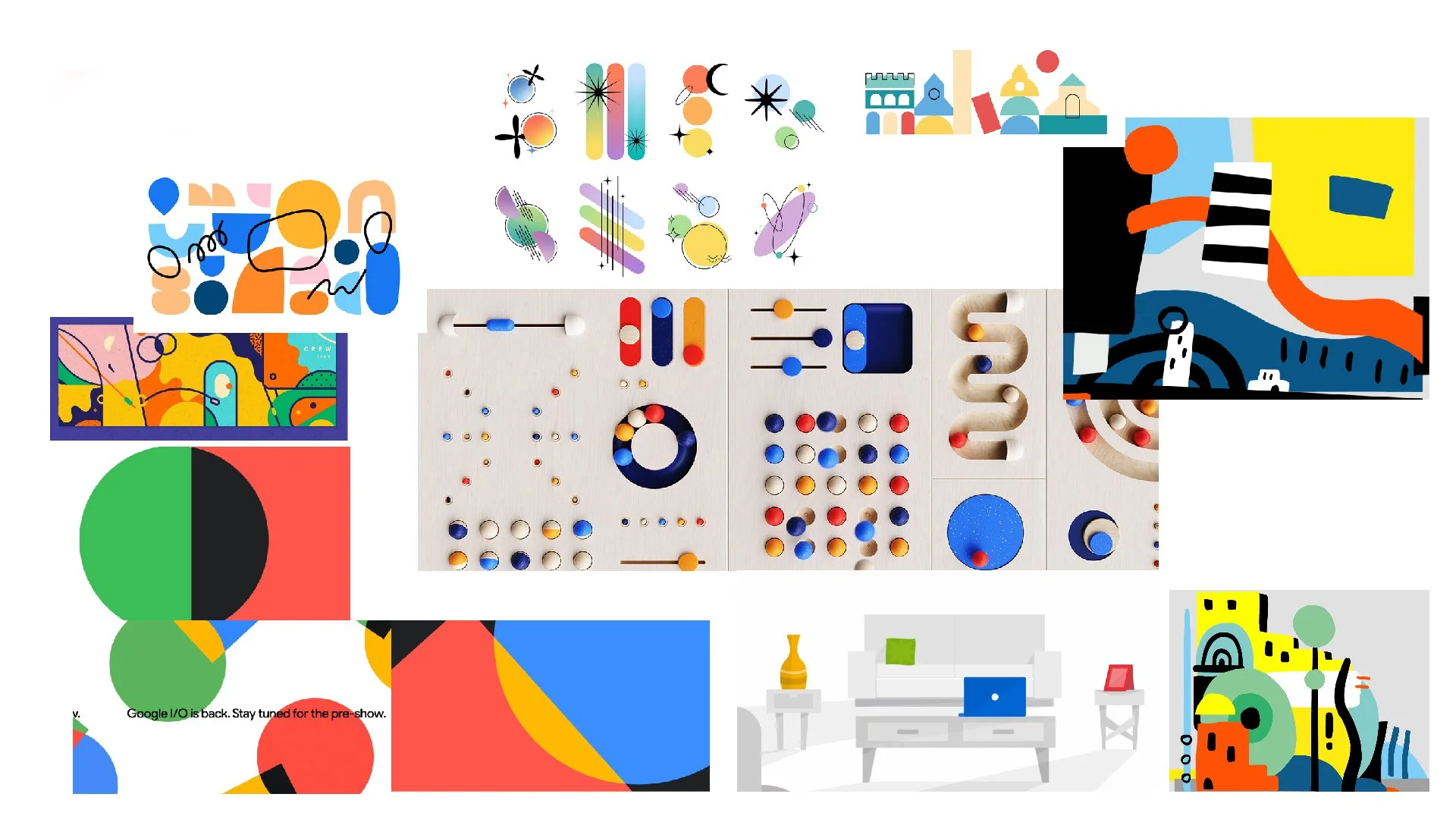
Visual references exploring flat abstraction, bold color fields, and geometric morphing — the foundation of the spot's motion language.
From concept to frame — locking the visual language.
Style boards translate the concept into production-ready frames, showing how the abstract color environment interacts with product reveals, typography, and the final call to action.
Ten frames. One arc.
The storyboard maps the full :30 — opening on pure abstraction, building through product hints, and resolving on the buy-it-now payoff.
 01
01


Don't bid, buy. Buy it now.
Two final cuts — a :30 and a :15 — produced in After Effects and Illustrator, color-pulled from the eBay logo, and built around the concept of revealing new items through morphing abstract shapes.
"Don't bid, buy.
Buy it now."
The full :30 — opening on pure color abstraction, morphing shapes reveal new products including sneakers, gaming controllers, and phones, resolving on the eBay logo and buy-it-now CTA.
Condensed for
broadcast efficiency.
A tighter :15 cut distilling the core visual concept and payoff — designed for broadcast placement alongside the hero :30.
Research first, concept second.
The most important decision on this project happened before a single frame was designed. Starting with primary market research — not brand guidelines or creative briefs — revealed the actual gap between how eBay saw itself and how consumers saw it. That gap became the brief, the concept, and the line.
Pulling color directly from the logo rather than going abstract was a deliberate choice: the brand deserved more than a mood. Every frame had to feel like it could only be eBay. The morphing shapes that never fully resolve until the end — that tension between tease and reveal — is what makes the concept work.
eBay TV Spot — Spec project. Research, concept, design, and production by Alex Runde. Not affiliated with eBay Inc.